
PROJECT
Chronos
CUSTOMER
Natura
SCOPE
Immersion and Multidimensional Research, Insights & Trends, Sustainable Innovation Strategy for Brands, Positioning, Brand and Portfolio Architecture, Visual Identity, Brand Design, Product and Packaging, Tone of Voice, Communication Strategy and Production, Digital Design, Sound and Motion, Ideation and Prototyping, Playbook.
How can we evolve an iconic brand, integrating beauty, science and sustainability into a more coherent and sophisticated experience over time?

Science, time, beauty and sustainability in harmony
Science, time, beauty and sustainability in harmony
Chronos proposes a freer, more authentic relationship with time, recognising that every stage of life offers new possibilities for discovering, expressing and experiencing one’s own beauty. In doing so, it embraces the legitimate desire for beauty and skin vitality without reinforcing age-related stereotypes or resorting to unrealistic promises.
For more than 35 years, the brand has transformed research and scientific knowledge into high-performance treatments tailored to the skin’s different biological cycles. Biociência Chronos embodies this commitment, connecting proven efficacy, sensory experience and a more holistic understanding of care.
Evolving this legacy meant integrating purpose, science, sustainability and expression in an increasingly complex context. More than communicating innovation, we needed to make it clear, tangible and desirable throughout the brand experience.
Context

![[AI] | Image created with AI support](https://images.squarespace-cdn.com/content/v1/67bf53854948a9223e3b2d34/a180da22-c58b-4559-b389-f93781fb3496/chronos_mockessencia.png)

![[AI] Detail of the graphic design for the packaging | Image created with the support of](https://images.squarespace-cdn.com/content/v1/67bf53854948a9223e3b2d34/e3f7f248-78c8-4589-b85f-4770289d680b/chronos_pp2.jpg)
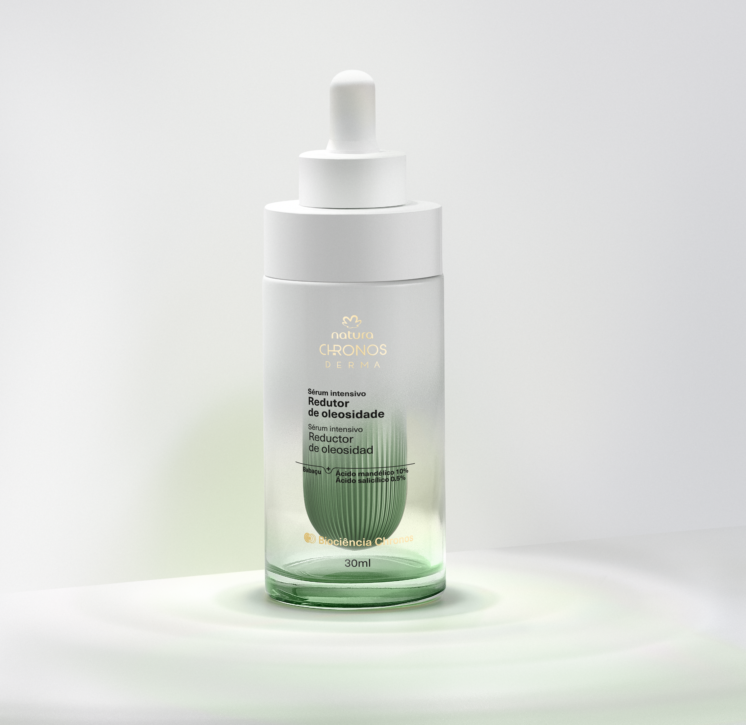

Through an ongoing partnership, we structured Chronos as an integrated system connecting strategy, innovation and expression. Our work encompassed positioning, brand architecture, visual identity, product and packaging design, communication and sustainability, ensuring consistency across the entire brand experience.
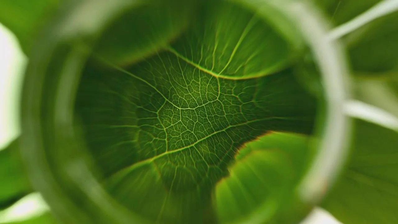
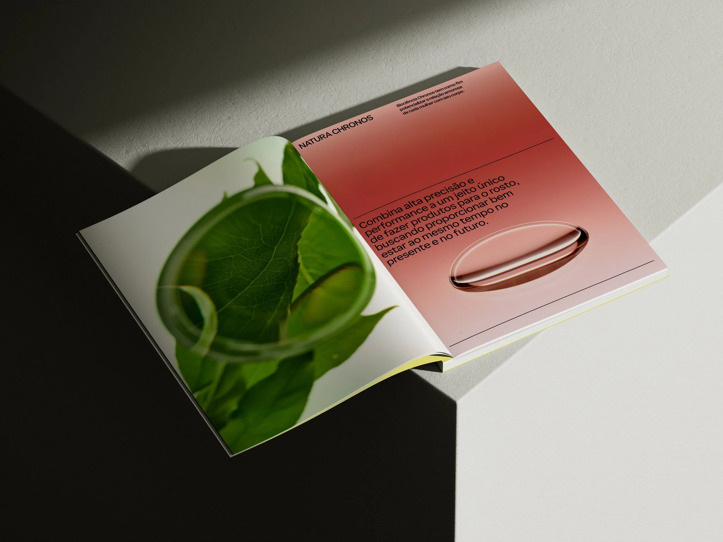
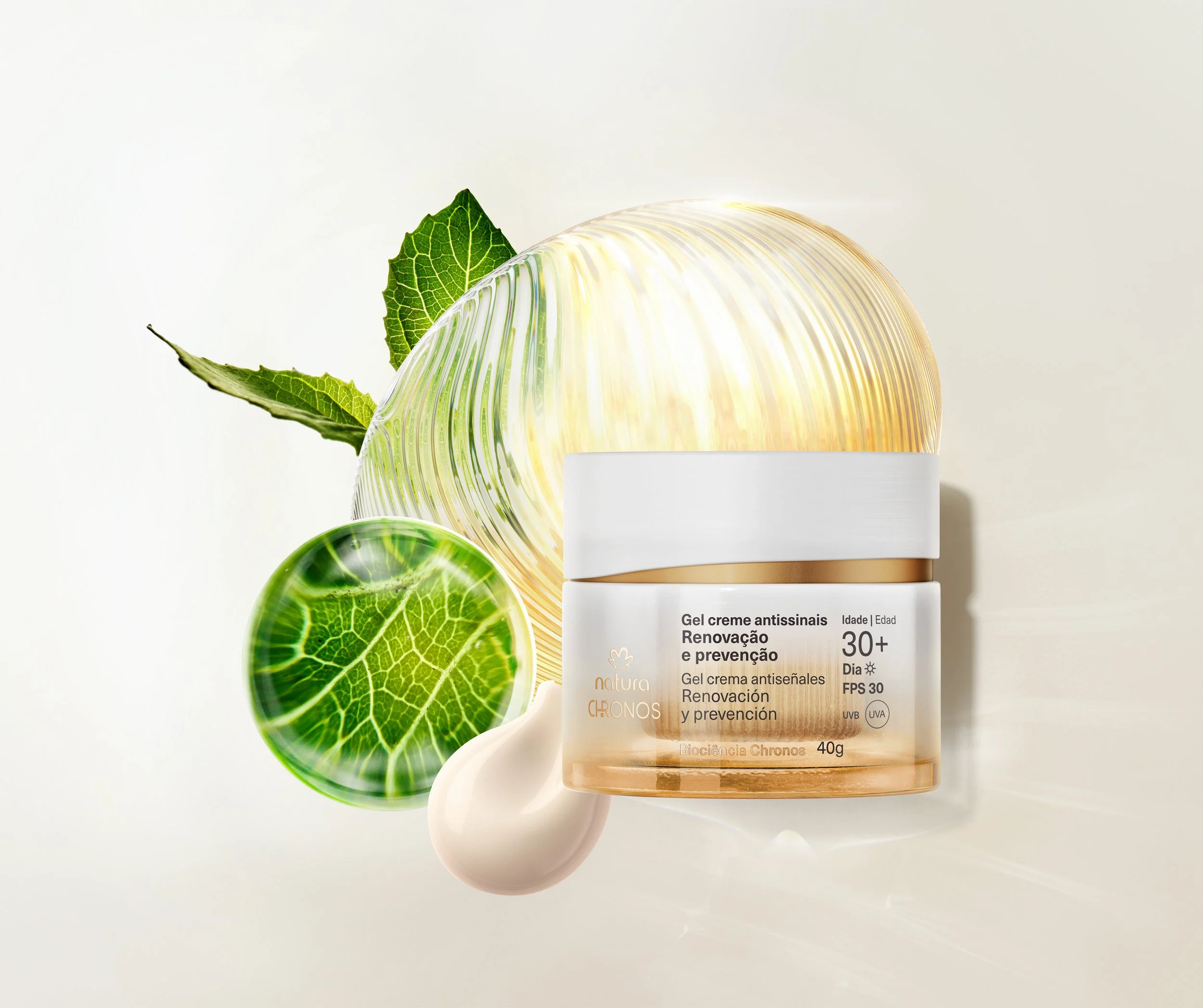
We developed a proprietary language for Biociência Chronos, with a visual repertoire inspired by cellular vitality, formulations, bioactive ingredients and the brand’s scientific processes. We translated invisible knowledge into images, materials, movement and sensory experiences capable of communicating innovation in an intuitive and desirable way. This approach also guided the development of more sustainable solutions, such as refillable packaging for serums, designed in close dialogue with production capabilities and requirements.
Inobi Approach


Elevating the experience
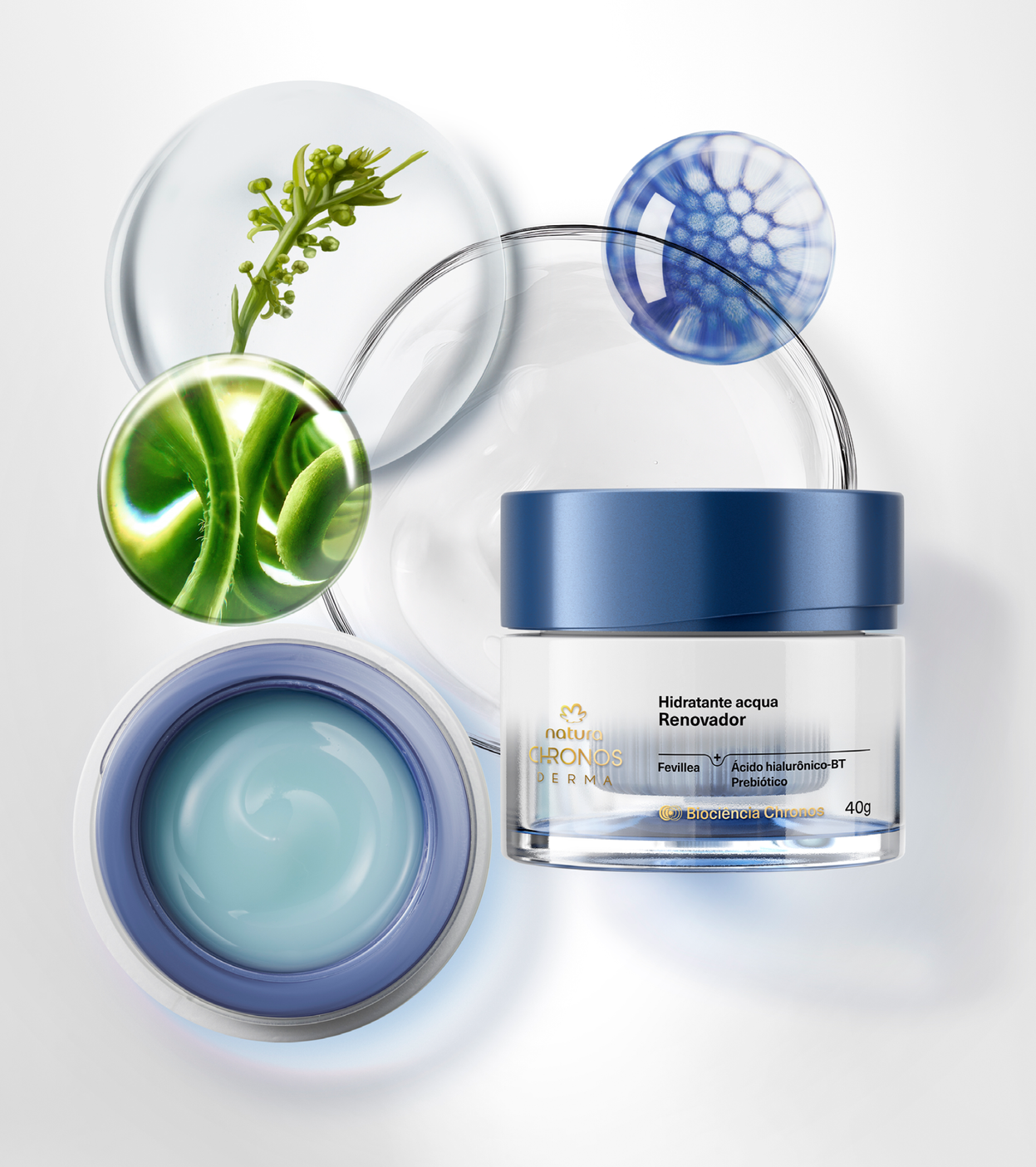
Chronos creates a more integrated connection between product, communication and brand perception. The visual language, materiality and brand expression were developed to strengthen the connection between bioscience, efficacy and sensory experience.
At the same time, a system of visual codes inspired by Biociência Chronos transforms formulations, bioactive ingredients and technologies into visual narratives that bring science and experience closer together. This integration allows the brand to communicate innovation clearly and consistently, while reinforcing brand recognition.
All of this while also reinforcing the brand’s commitment to the concept of the ‘truly beautiful woman’, inviting inspiring women over 80—who were not necessarily models—to represent the launch of the 80+ line.
System in Practice

Outcome
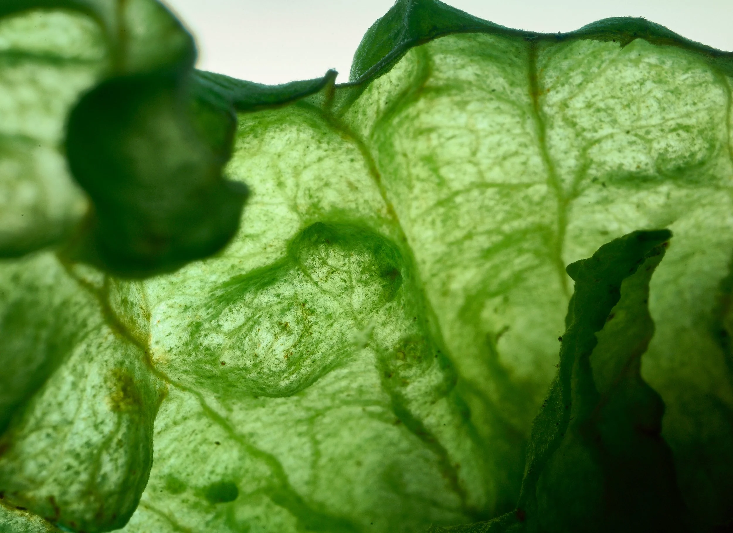
Chronos strengthens its positioning by integrating science, sustainability, performance and a freer, more authentic vision of beauty into a proprietary brand system.
This integration comes to life from product to communication, connecting formulations, packaging, visual codes and experiences through a single language capable of translating its Biociência in a way that is clear, recognisable, effective and desirable.
In this way, Chronos expands its capacity to innovate while preserving coherence between its legacy, its evolution and its way of understanding beauty.
Credits
This case study brings together different stages of the project, developed over several years. The credits below represent the professionals who contributed to its evolution during that time.
-
Creative Direction: Filomena Padron, Raphael Patapovas
Project Management: Ana Paula Rezende, Victor Godinho
Art Direction: Luciano Colucci
Creative Team: Caroline Pereira, Julia Rennhard, Odilon Queiroz, Patrick Kohout, Thamiris Stano
Strategy: Eduardo Weinhardt
Storytelling and Content: Silvio Fudissaku
Art Buyer: Paula Dias -
Executive Production: Aboé, Thinkers
Photography: Vivi Bacco
Product Photography: João Ávila, Origo Lab
Beauty:Jake Falchi
Styling: Jeff Ferrari
Set Design: Mario Mantovanni
Video: Origo Lab, Rikko Oliveira
Visual Effects (VFX):Hugo Miguel, Malcolm Oakley
Image Processing:Dr. Raw, Helder Bragatel -
Natura Team: Camila Pereira, Camila Pires, Carolina Rodrigues, César Belém, Fabiana Almeida, Fernanda Delfini, Mariana Zavanella, Melina Balassanian, Nathalia Salgado, Natalia Picolomini