

PROJECT
Butantan
CUSTOMER
Butantan Institute
SCOPE
Immersion and Multidimensional Research, Stakeholder Interviews, Brand Strategy, Positioning, Brand Architecture, Visual Identity, Graphic System, Art Direction, Communication Guidelines, Sub-brand System and Playbook.
How can one of Brazil’s most recognised scientific brands evolve without losing what makes it unique?
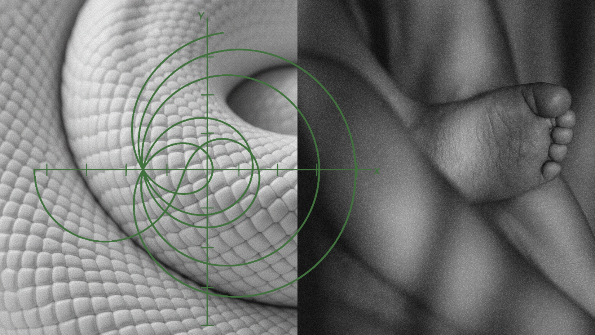
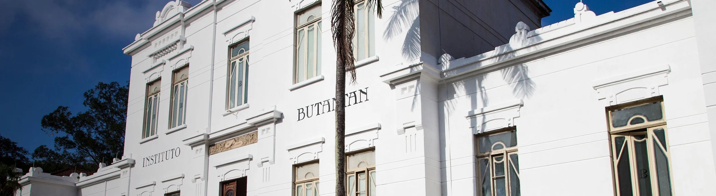
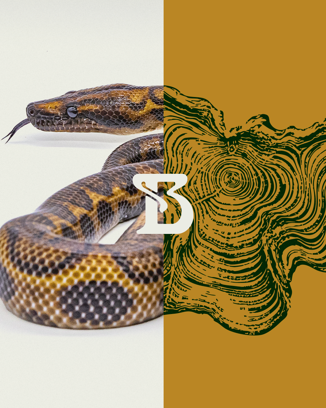

As Instituto Butantan marked its 125th anniversary, it began a process of evolving its institutional identity.
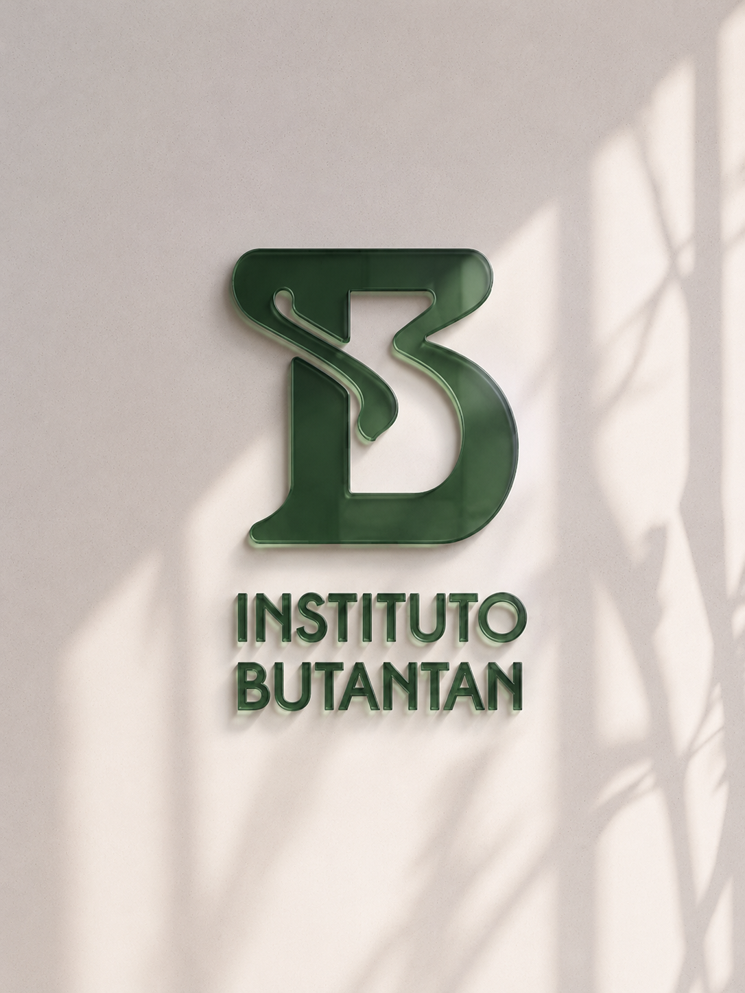
The challenge was to redesign the brand around its existing symbol, preserving the recognition and trust built over decades while bringing greater unity, clarity and relevance to its expression for the future.
The growing diversity of centres, initiatives and services also called for an architecture capable of revealing Butantan as a single institutional ecosystem.
Context
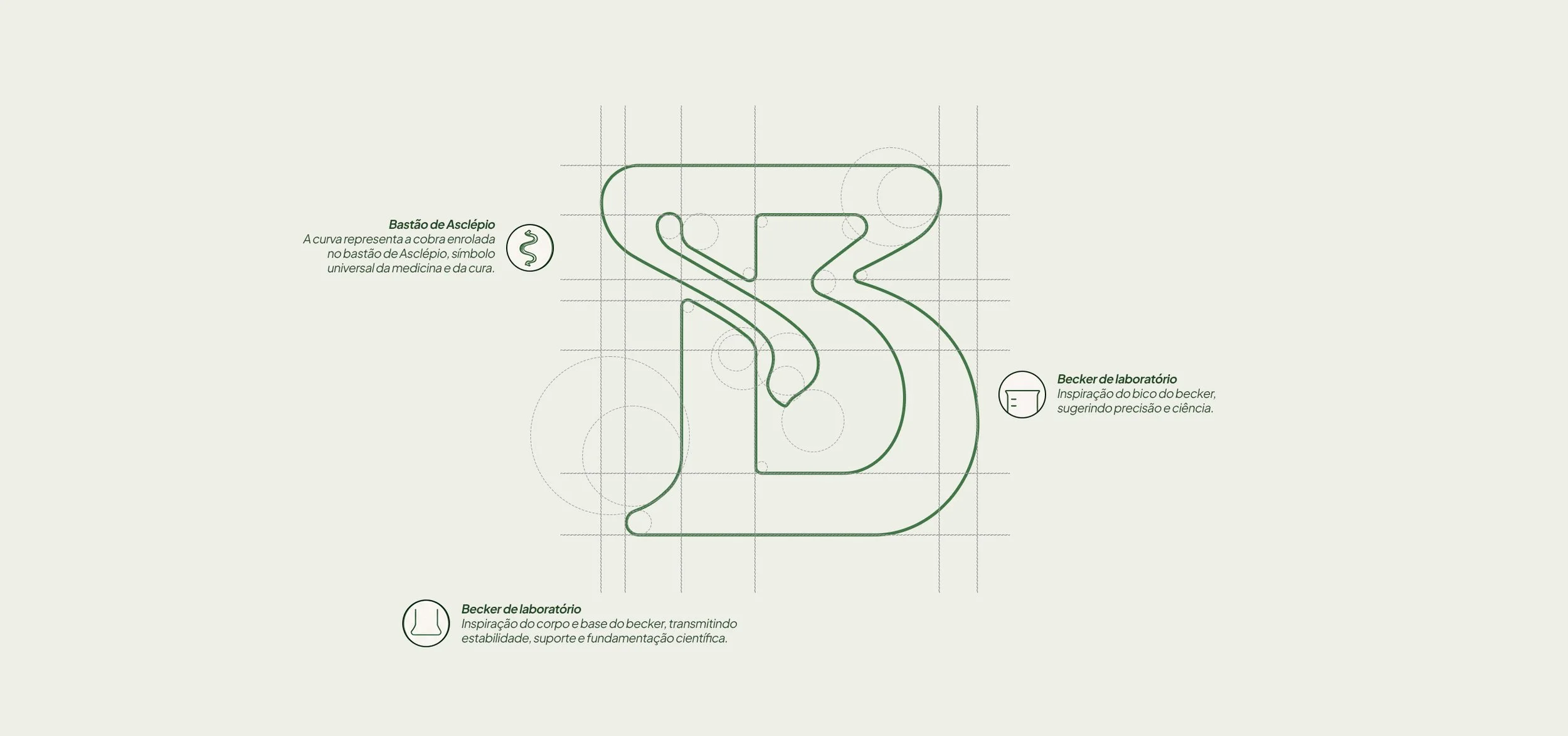
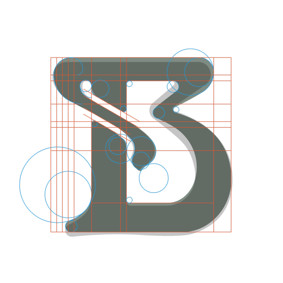
Reconstruction of the letter B
Science, nature, and life
in one system.
Redesigning from the essence.
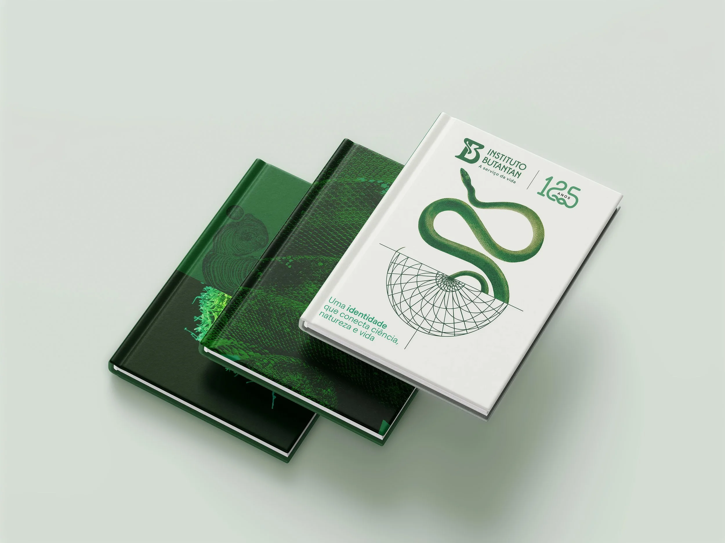
We immersed ourselves in the Institute’s history, architecture, scientific culture and visual memory. This immersion was complemented by interviews with researchers, leaders and a range of stakeholders.
This process showed that the new identity should not be created from the outside in. It had to emerge from Butantan itself, finding in its heritage the principles for moving forward.
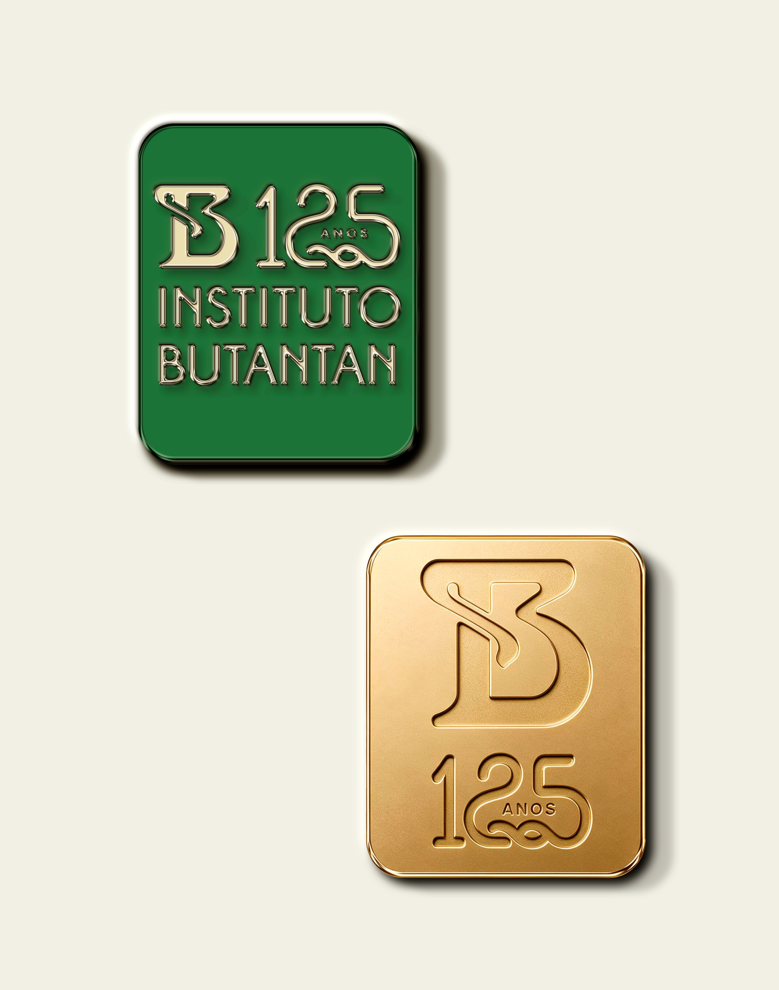
In studying the historic symbol, we found in the golden ratio a way to refine its curves and inner spaces without losing the form recognised by the public.
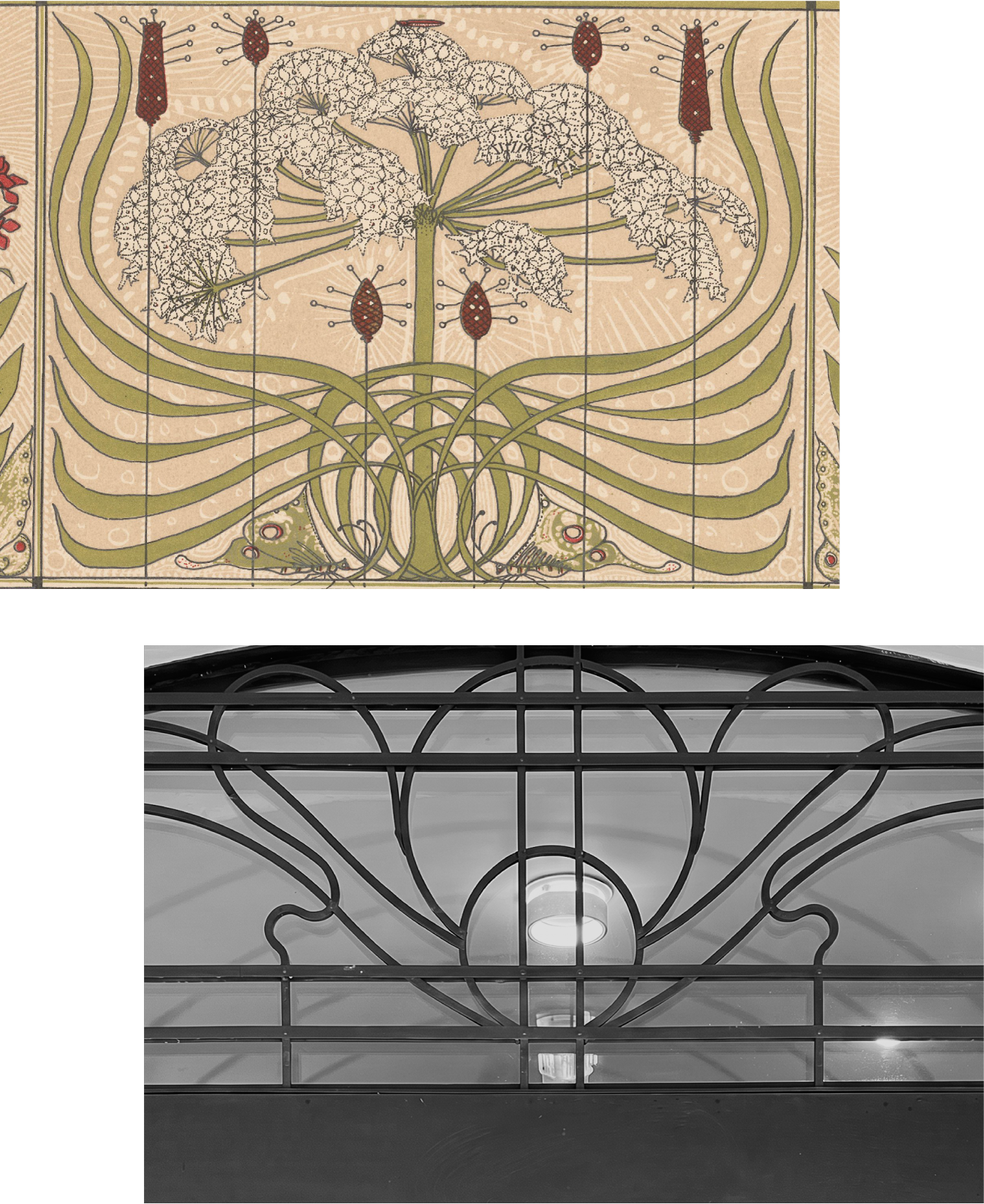
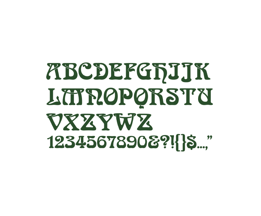
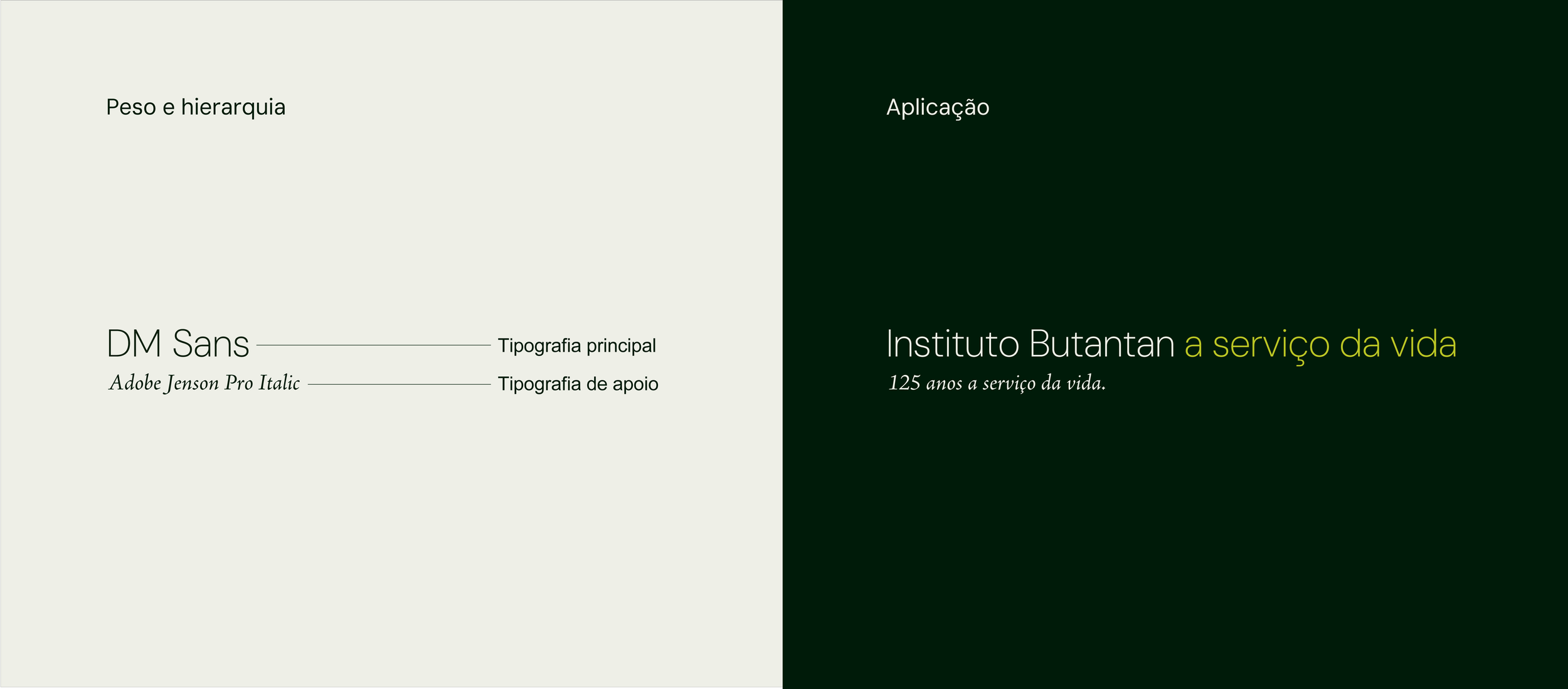
The new lettering also grew out of references from the institution itself. We interpreted the letters on the façade of the Vital Brazil Building and connected the high, curved diagonal of the ‘N’ to the branching structures found in Linnaean taxonomy diagrams.
Building on these discoveries, we developed a visual system inspired by the relationships between science, nature and technology, and reorganised the brand architecture to integrate the Institute’s different areas of activity.
Inobi Approach
Preserving history. Strengthening the future.
A system for communicating science.
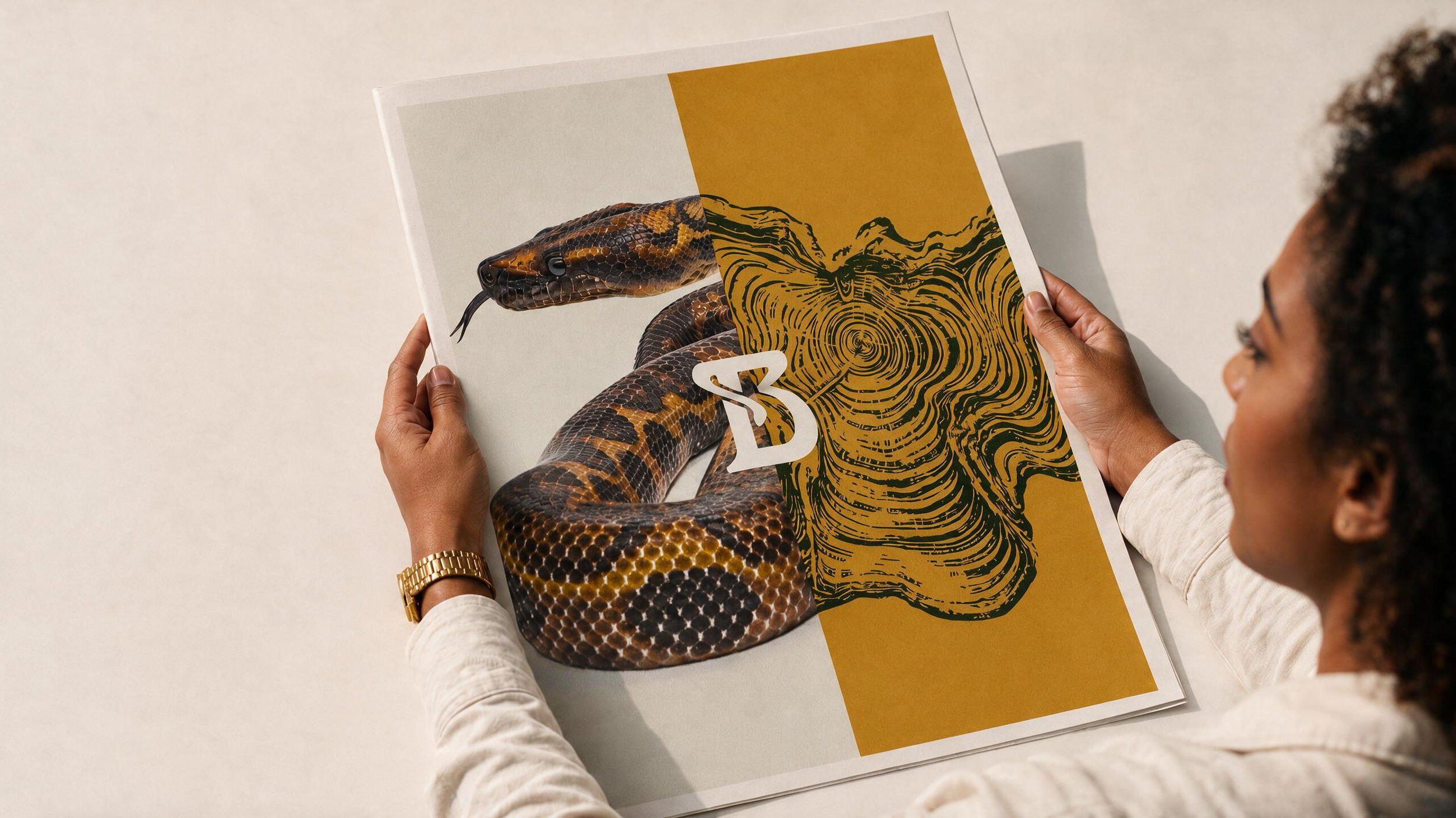
The new visual system translates science into a living organism.
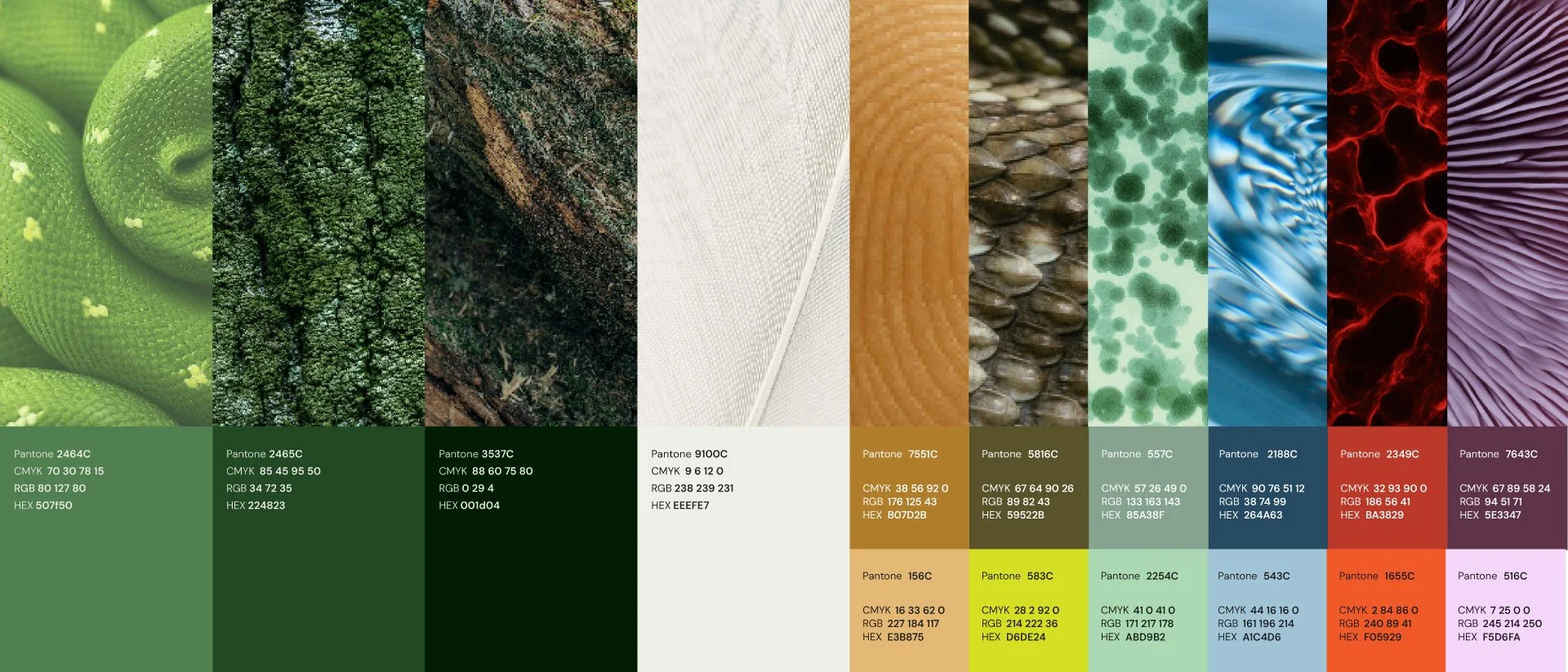
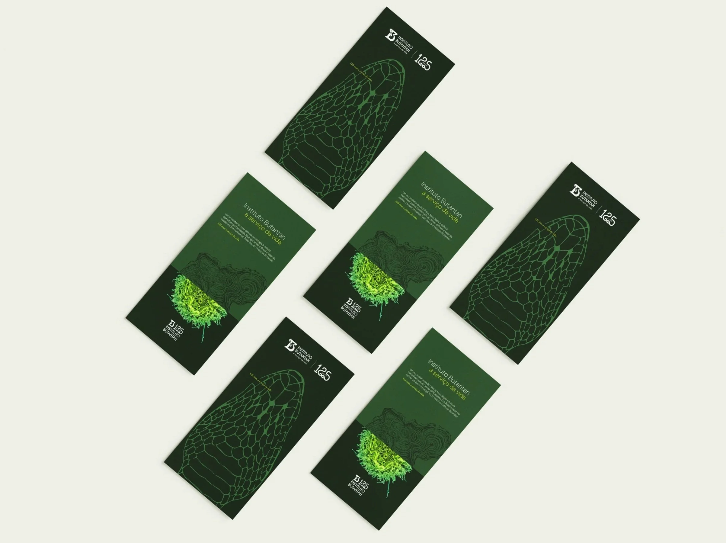
Macrophotography, scientific imagery, organic structures and references to biodiversity create a language that brings research, innovation and social impact into closer connection.
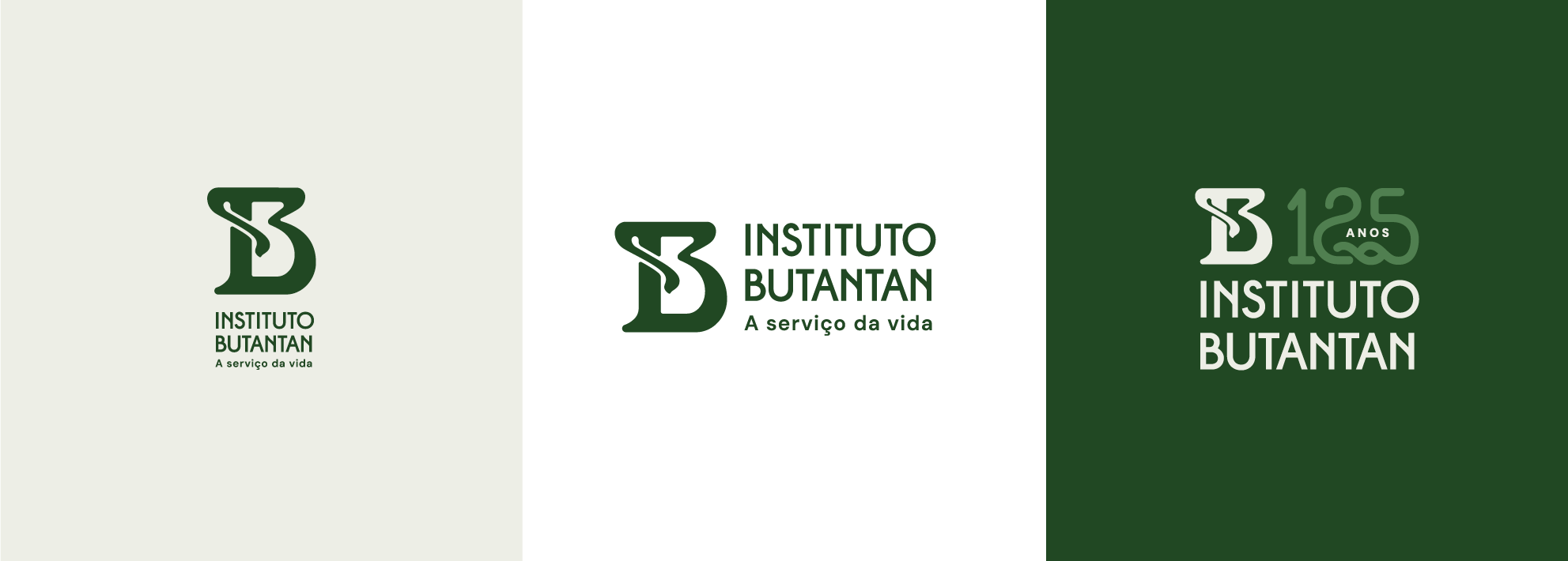
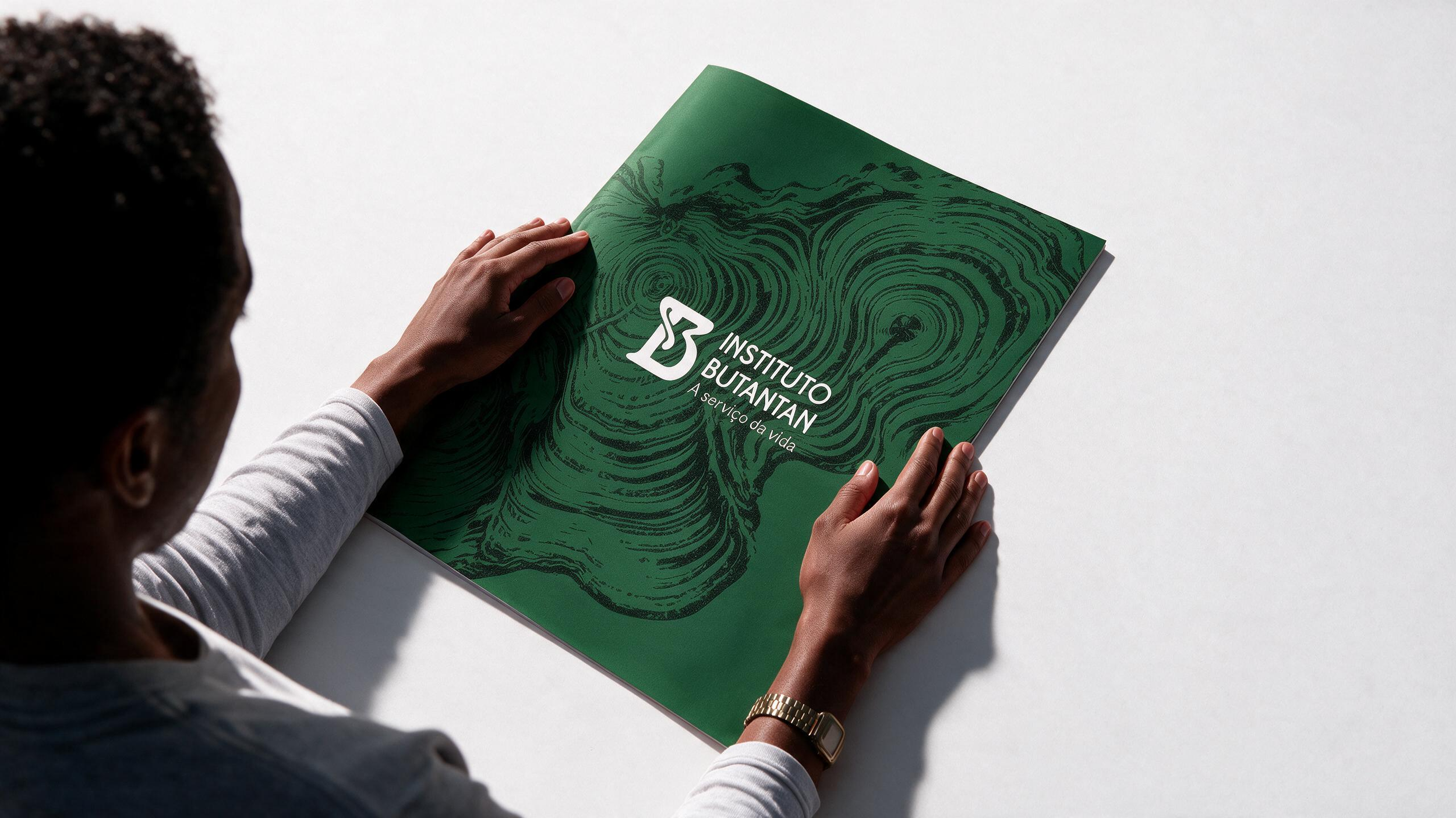
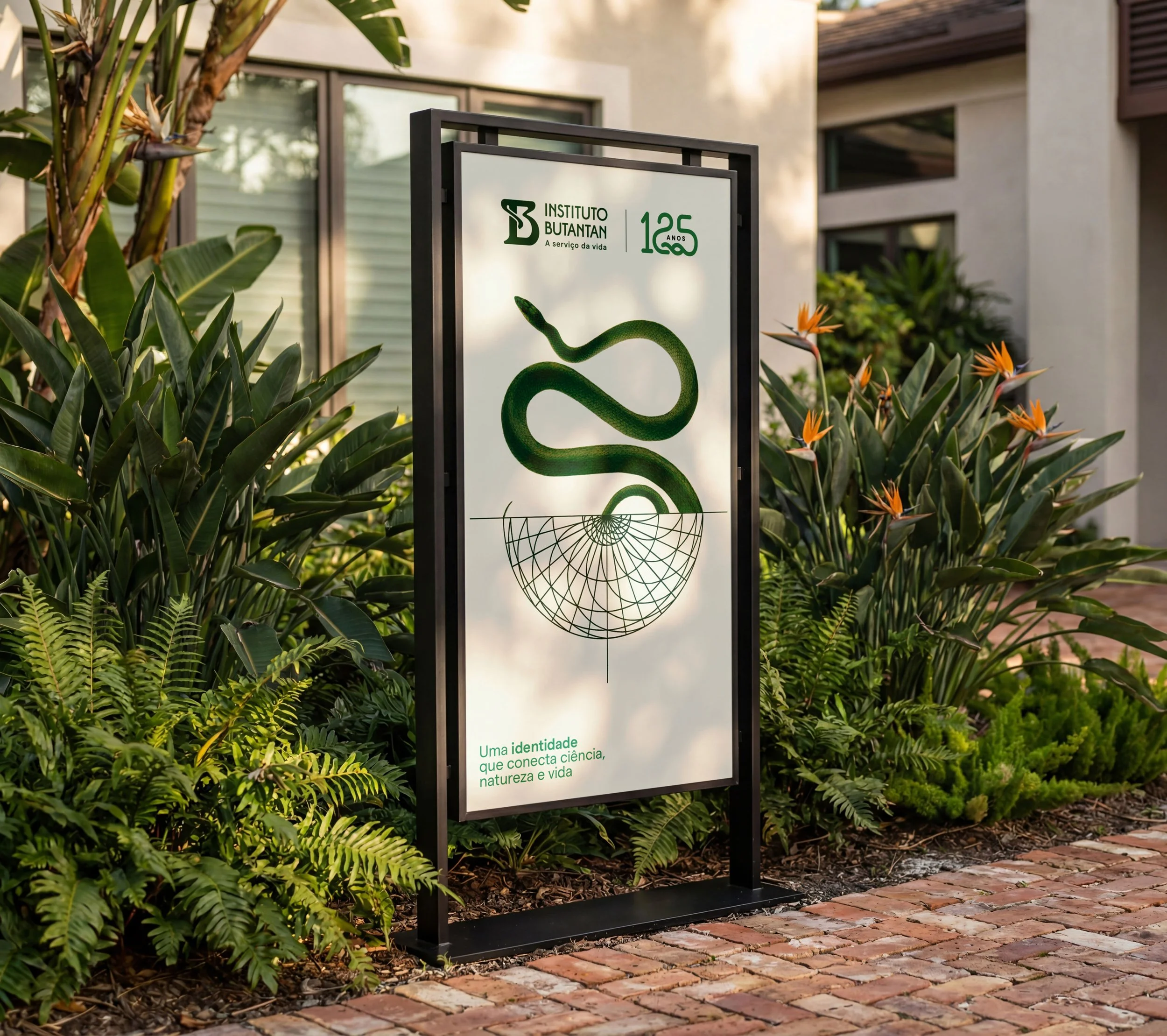
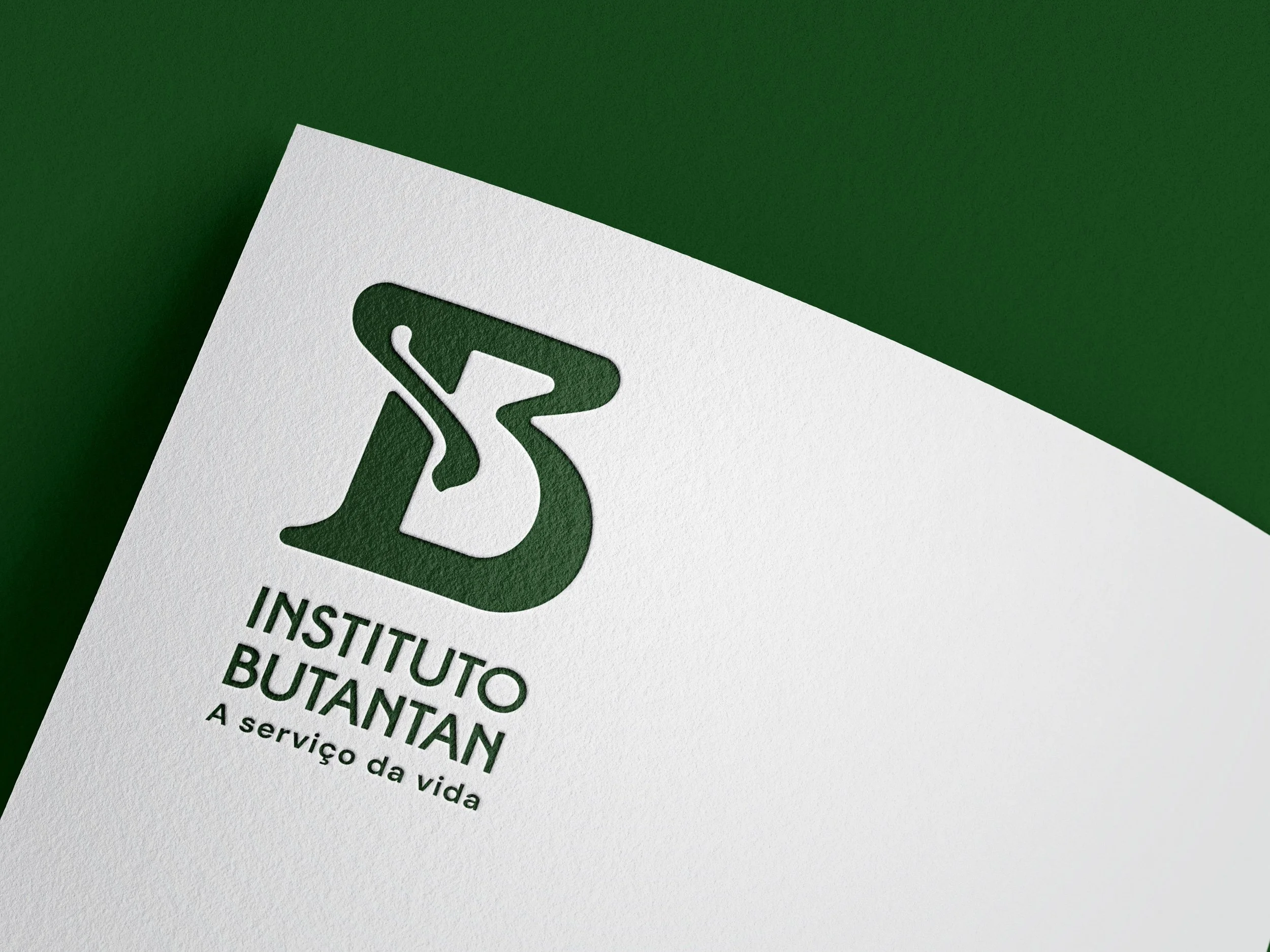
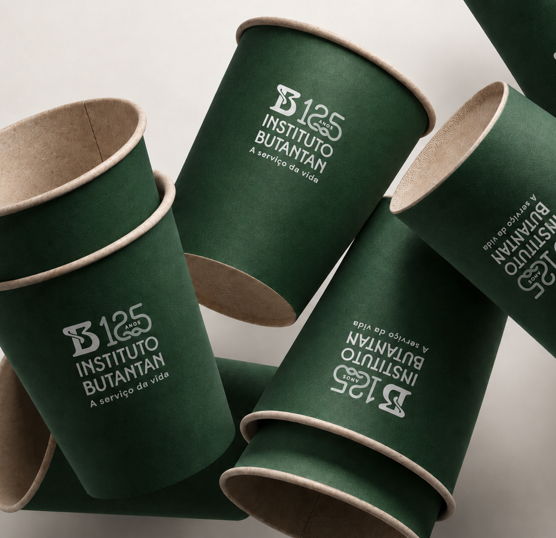
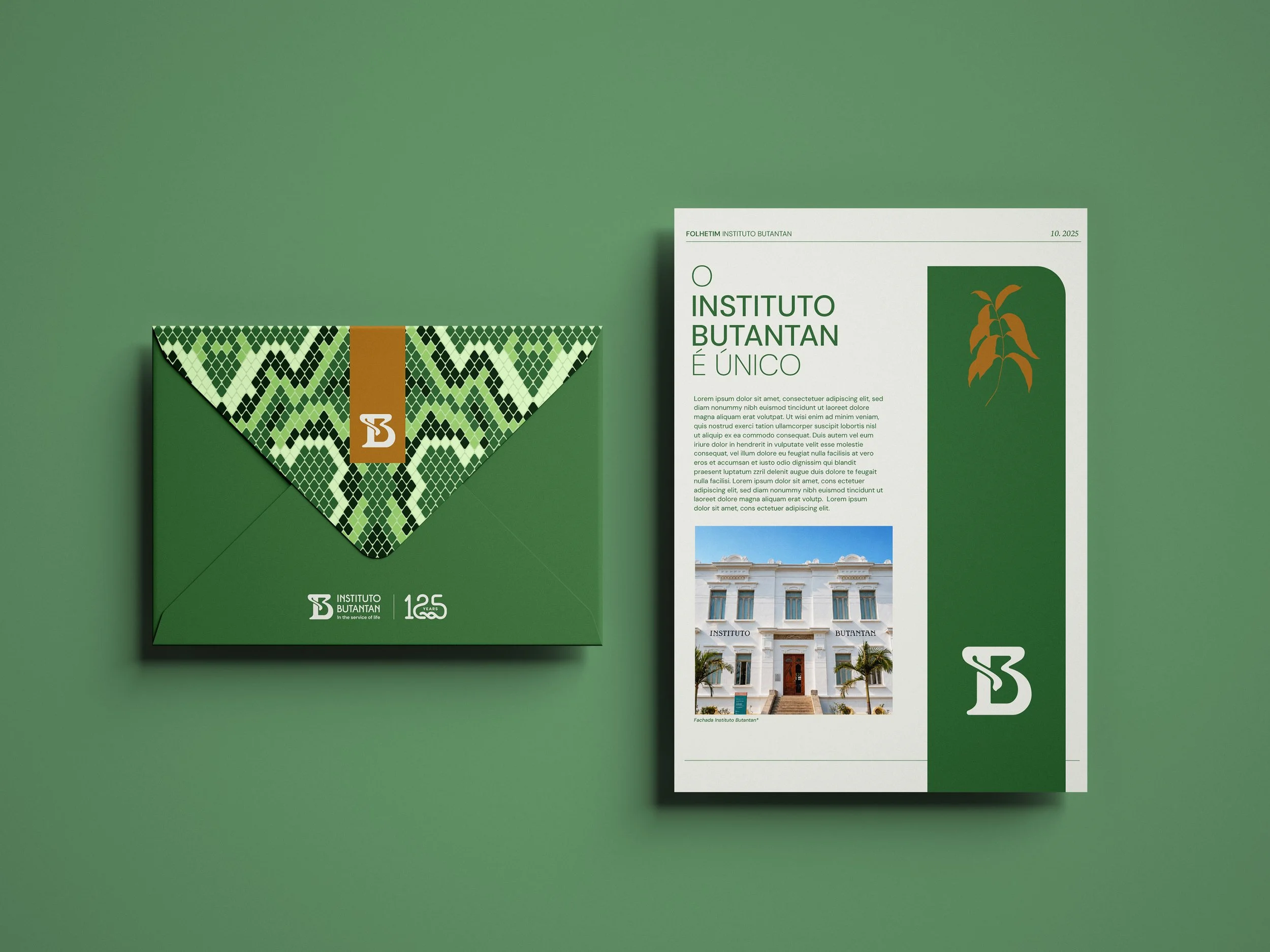
The updated symbol, the lettering, the expanded colour palette, the 125th-anniversary identity and the new brand architecture work as an integrated system.
System in Practice
Outcome
The project established an identity that preserves Butantan’s recognisable codes while expanding its ability to express itself, bringing history and future into resonance.
By integrating identity, visual language and brand architecture, the system strengthens the perception of Butantan as a single institution, connecting its different areas of activity and expanding its ability to communicate science with clarity, consistency and relevance for generations to come.
-
Creative Director: Filomena Padron
Art Direction at Butantan Institute: Rafaela Ranzani
Project Management: Ana Paula Rezende
Art Direction: Laila Rodrigues
Creative: Kauane Corrêa
Storytelling and Content: Silvio Fudissaku -
Photographs from the Butantan archive used as the foundation for building the language and visual identity.
-
Butantan Institute
Art Director at the Butantan Institute: Rafaela RanzaniDirector of Communications: Victor Ramos
Communications Manager: Bianca Poli
Credits